Iconic Album Covers and the Wild Stories Behind Them
For artists and fans alike, album covers serve as more than just packaging; they are gateways to stories filled with creativity, controversy, and the madness of rock ‘n’ roll. The Beatles’ legendary stroll across Abbey Road and Nirvana’s unforgettable image of a baby swimming after a dollar bill underwater represent moments of artistic inspiration or rebellious energy. These album covers capture the essence of the artist’s music and its spirit. Some express a moment or an intimate self-portrait of them, while others present daring designs. However, all have left millions of fans worldwide with unforgettable images that are now inextricably linked to the music itself. Let’s peel back the vinyl and dive into the wild tales that rock as hard as the tunes inside.
Queen – Queen II (1974)
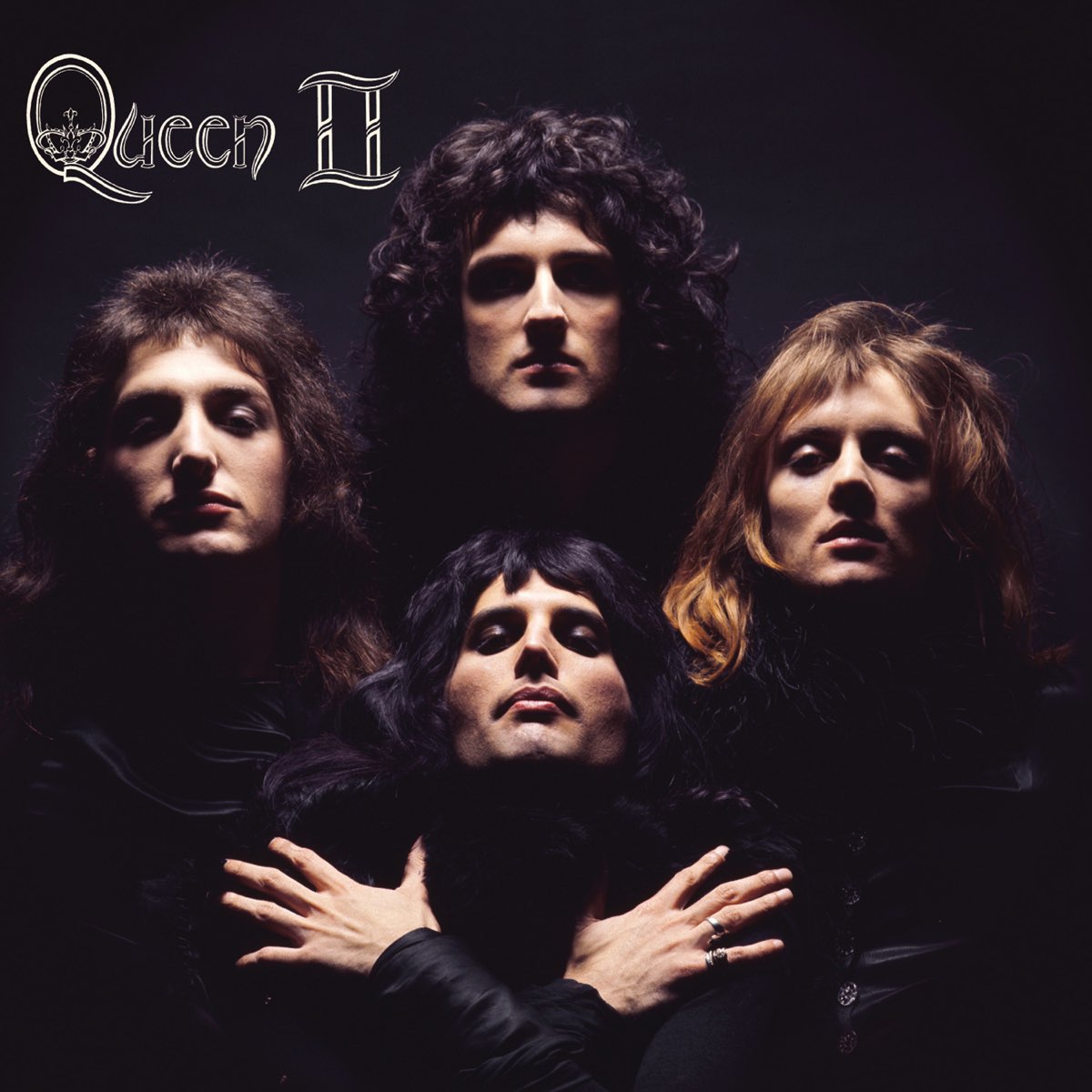
In an effort to attract all eyes on Queen, talented photographer Mick Rock positioned the band members into a unique formation against a dark backdrop. Each member gazes into the camera with a nonchalant intensity, with Freddie Mercury crossing his arms over his chest. Their lit-up expressions exude a sense of gravitas and grandeur, evoking the feeling of witnessing a historic moment. The shoot was meticulously planned to capture not just a portrait, but an enduring image that would come to symbolize Queen’s artistic proficiency and theatrical presence.
The Who – The Who Sell Out (1967)
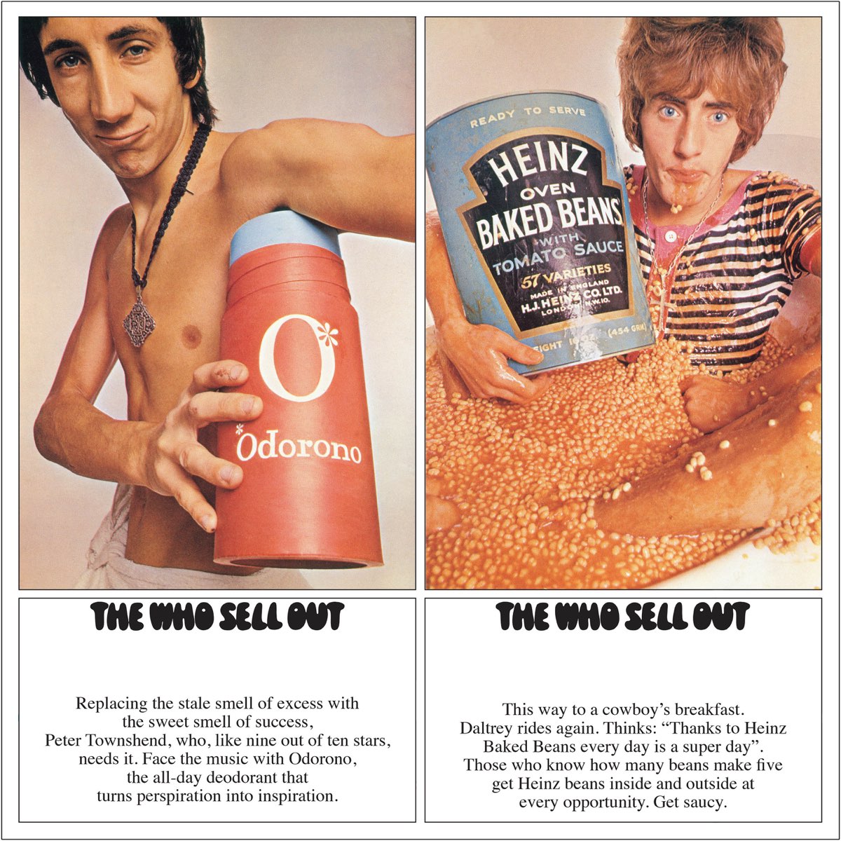
The Who decided to pose as models for various mock advertisements, incorporating satire and humor into the concept of their The Who Sell Out album. The cover’s innovative and playful approach was ahead of its time, blending music with visual satire. The band members embraced the concept fully, recording jingles and commercials to intersperse between tracks, creating a cohesive narrative of a pirate radio broadcast. Hits like “I Can See for Miles” and fan favorites like “Mary Anne with the Shaky Hand” showcased The Who’s eclectic mix of rock, pop, and experimental elements, making The Who Sell Out a groundbreaking album in concept and execution.
Nirvana – Nevermind (1991)
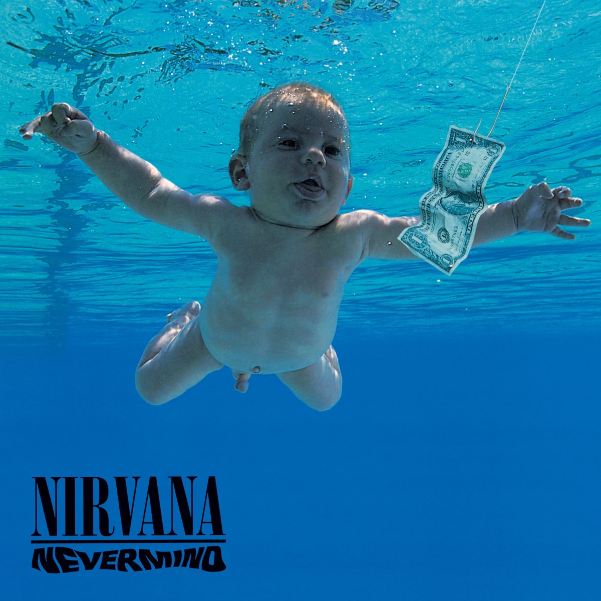
Baby Spencer Elden gained elite status as the dollar-chasing infant on Nirvana’s Nevermind cover, perhaps the coolest claim to fame for a toddler. Imagine the auditions: “Alright, babies, swim towards that dollar!” The heated pool provided comfort, but the competition was as intense as ice-cold waters. At just four months old, Spencer aced the shoot, setting the stage for one of rock’s most enduring images. The cover concept, devised by Kurt Cobain, aimed to symbolize innocence and capitalism’s allure. In 2021, Elden filed a lawsuit against Nirvana, alleging that the image constituted child pornography and that he suffered lifelong damages as a result. Elden’s lawsuit named various parties, including surviving band members, Kurt Cobain’s estate, and the photographer, Kirk Weddle. However, in January 2022, a judge dismissed Elden’s case after he missed a deadline to respond to the defendant’s request for dismissal. Elden refiled the lawsuit, but it was dismissed again in September 2022 on the grounds that Elden had waited too long to claim that the image violated federal child pornography statutes.
Pink Floyd – The Dark Side of the Moon (1973)

When Pink Floyd set out to design the cover for The Dark Side of the Moon in 1973, they aimed for a showstopper. They enlisted Hipgnosis, a British company known for creating some of the most iconic album cover art in the music industry, and artist George Hardie, who created the famous prism dispersing light into a rainbow. This image perfectly emulates the band’s cosmic vibe and Roger Waters’ vision for something unforgettable. Waters declared, “Let there be light, and a killer album cover!” The result? A timeless piece of art that still dazzles and remains one of music history’s most recognizable covers.
Blondie – Parallel Lines (1978)
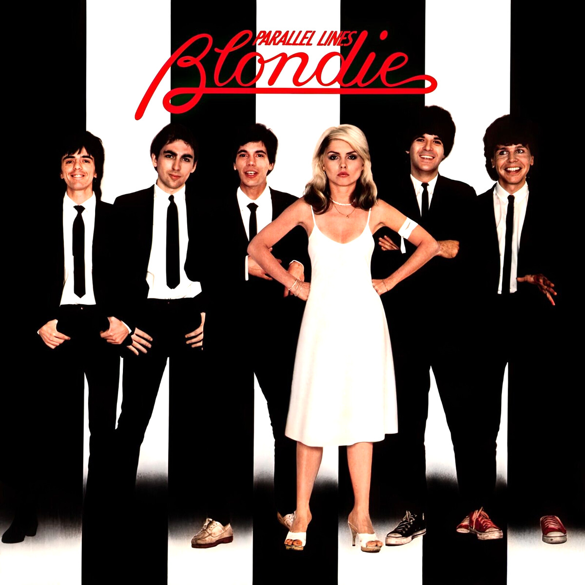
Parallel Lines depicts a striking blend of simplicity and punk attitude on its cover, perfectly capturing Blondie’s edgy, yet chic vibe. The cover features the band members in black and white against a background of parallel lines, with Debbie Harry standing out in a white dress amidst her bandmates’ dark suits. This stark visual contrast underscores the album’s themes of individuality and rebellion. Designed by Ramey Communications, a company located in Los Angeles, and photographed by Edo Bertoglio, the cover’s minimalist design reflects the band’s no-nonsense approach to music. The choice of black and white was also a nod to the band’s name, highlighting Debbie Harry’s famous platinum blonde hair.
David Bowie – Aladdin Sane (1973)
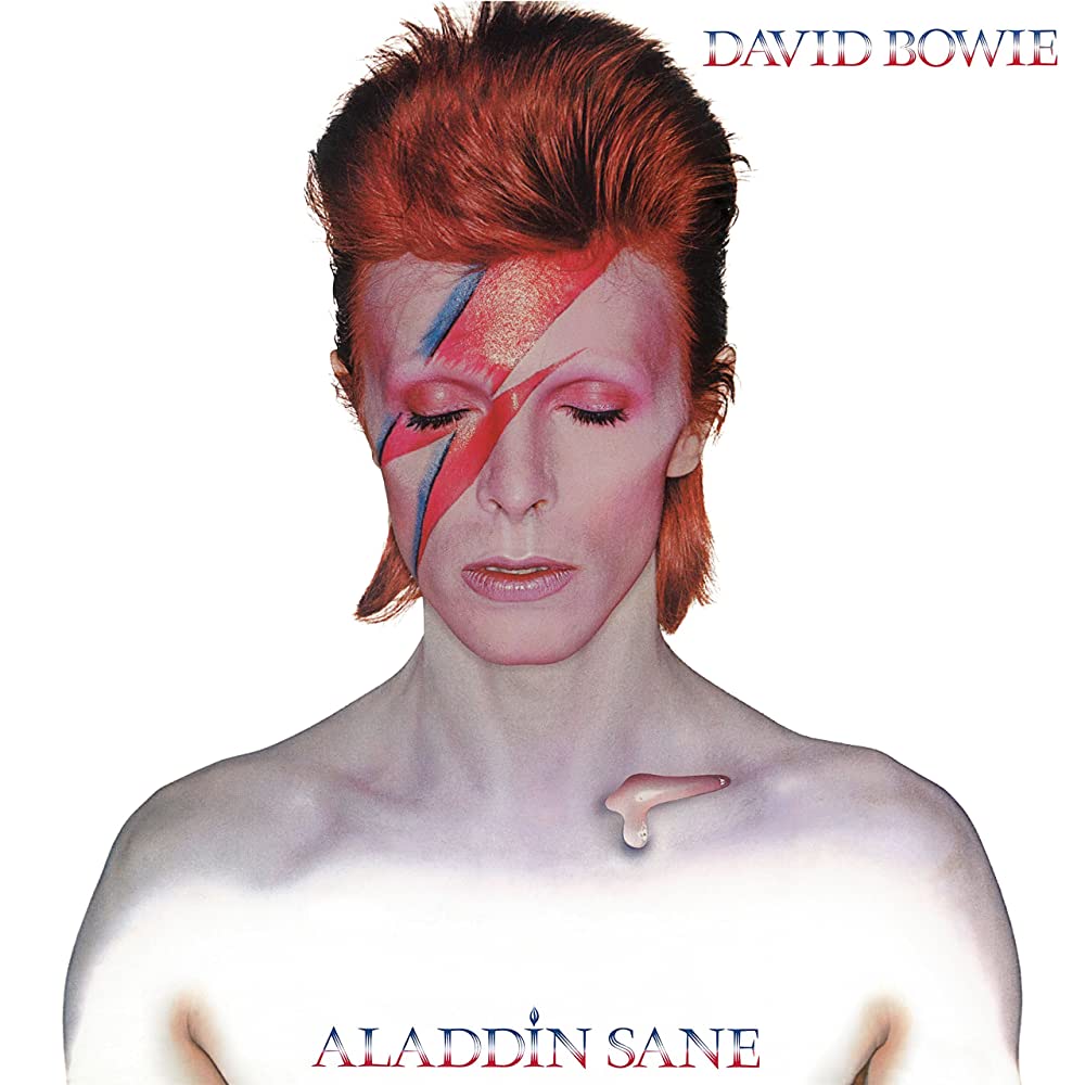
Photographer Brian Duffy captured this lightning bolt of creative genius in a single session. The iconic image, featuring Bowie adorned with electrifying makeup, epitomized the audacious spirit of glam rock and Bowie’s relentless pursuit of reinvention. Behind the scenes, perfecting the makeup took hours, blending theatrical flair with avant-garde fashion. Duffy’s photography skillfully framed Bowie’s enigmatic gaze against a minimalistic backdrop, underscoring the album’s themes of identity and metamorphosis.
The Beatles – Sgt. Pepper’s Lonely Hearts Club Band (1967)
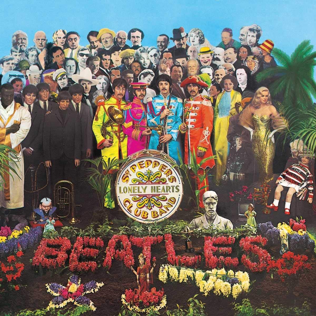
The Beatles didn’t merely don military garb for Sgt. Pepper’s Lonely Hearts Club Band; they threw a cultural extravaganza, inviting everyone from Marilyn Monroe and Marlon Brando to Karl Marx and Oscar Wilde to their album cover party. The idea was brought to life by British pop artist Peter Blake and his then-wife, Jann Haworth. It was not just to show a band surrounded by fans, but rather to create an eclectic collage of cultural icons, reflecting the band’s avant-garde and experimental approach to the album. This inclusion of over 70 life-sized cardboard cutouts was also intended to illustrate the wide-ranging influences on The Beatles’ music and evoked a sense of nostalgia and celebration. The cover became one of the most famous and recognizable images in music history, symbolizing the band’s innovative and boundary-pushing spirit.
Guns N’ Roses – Appetite for Destruction (1987)
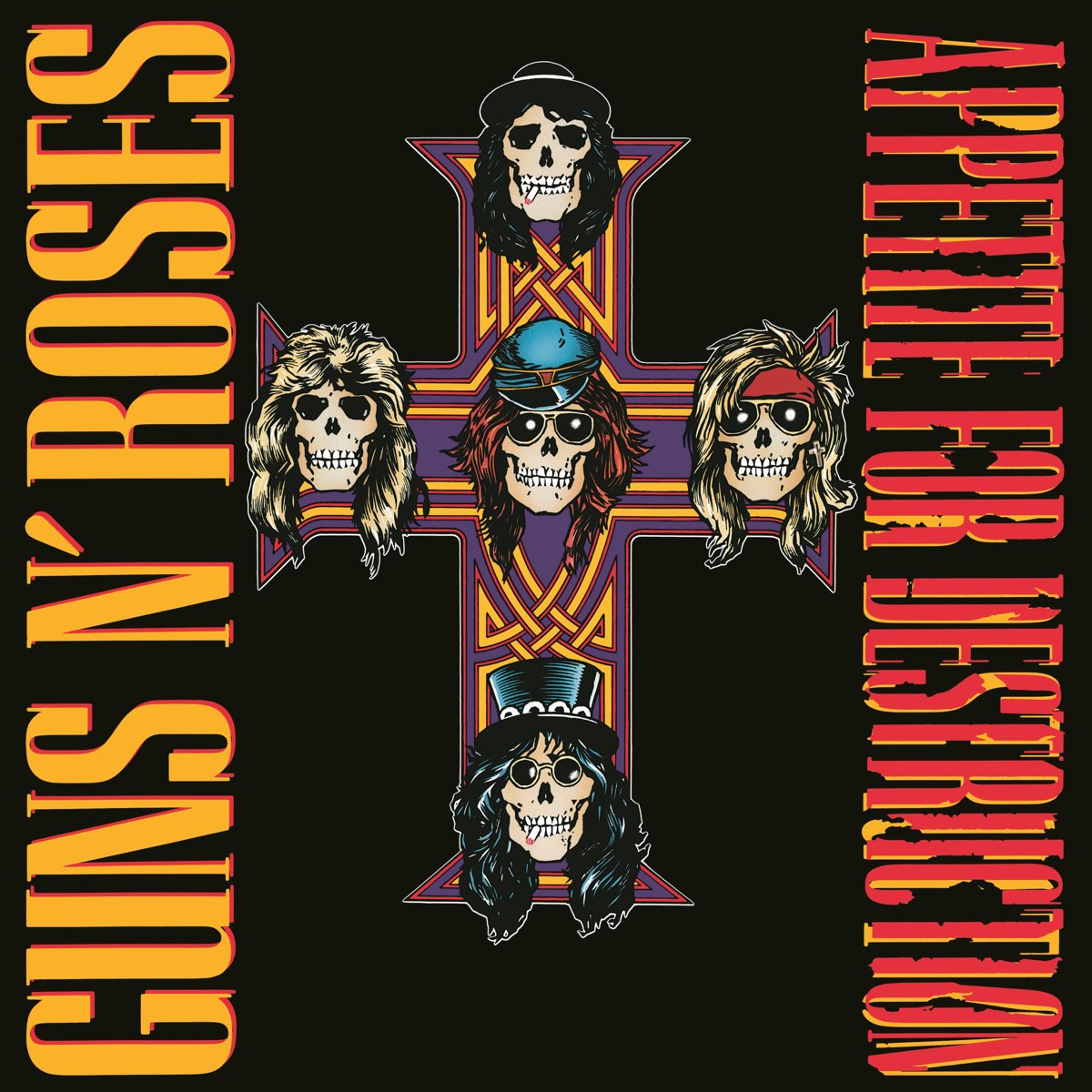
The artwork of Appetite for Destruction, crafted by Robert Williams, originally displayed a provocative depiction of a robotic figure facing imminent justice from a metallic avenger. This daring and contentious imagery, intended for the album’s inner sleeve, caught the band’s attention and was elevated to its primary cover. The gritty and rebellious tone stirred significant backlash and was censored by certain retailers. Due to this, the cover was quickly replaced by a more widely recognized alternative. The new cover featured a cross with skulls representing the five band members. Each skull was adorned with features representing their personas. The original cover remains a part of the album’s lore, reflecting the rebellious and confrontational nature of the band during that era.
Led Zeppelin – Led Zeppelin (1969)
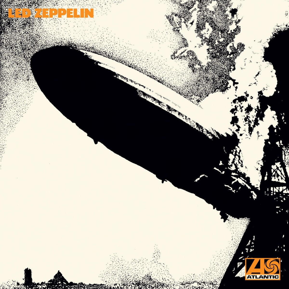
Led Zeppelin’s self-titled debut album cover boldly featured a dramatic shot of the Hindenburg disaster, adapted by graphic designer George Hardie. Critics and industry insiders predicted that the album would be a commercial failure, with The Who drummer Keith Moon supposedly using the phrase “sink like a lead balloon” to describe their expectations. This phrase was humorously adapted by the band into “Led Zeppelin,” which ultimately became their name. The juxtaposition of fiery destruction and explosive rock ‘n’ roll encapsulated the essence of Zeppelin’s magic, setting the stage for their distinct sound. Selecting this image was a deliberate statement, reflecting the band’s desire to convey power and intensity through their music and visual identity. This cover remains a striking symbol of Led Zeppelin’s influential presence in the rock music landscape.
Fleetwood Mac – Rumours (1977)
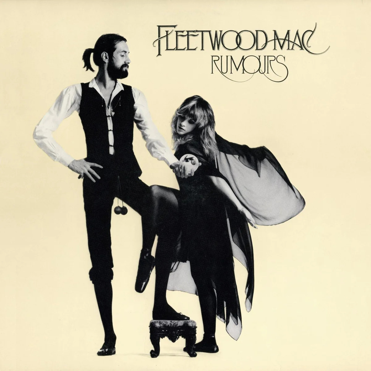
Fleetwood Mac’s Rumours cover, designed by Desmond Strobel, is a simple photograph of bandmates Mick Fleetwood and Stevie Nicks, each framed individually with a unique lighting effect. The balls hanging between Fleetwood’s legs are lavatory chains he drunkenly stole from a club toilet during one of the band’s early tours. He found it amusing and made it part of his stage persona. The cover’s design also reflects the personal and emotional turmoil within the band during the album’s recording, mirroring their themes of love, heartbreak, and resilience. Strobel nailed the vulnerability and strength of the two, emphasizing the album’s candid exploration of relationships. Hits like “Go Your Own Way,” “Don’t Stop,” and “Dreams” propelled this album to critical acclaim and commercial success, becoming one of the best-selling albums of all time.
Kendrick Lamar – To Pimp a Butterfly (2015)
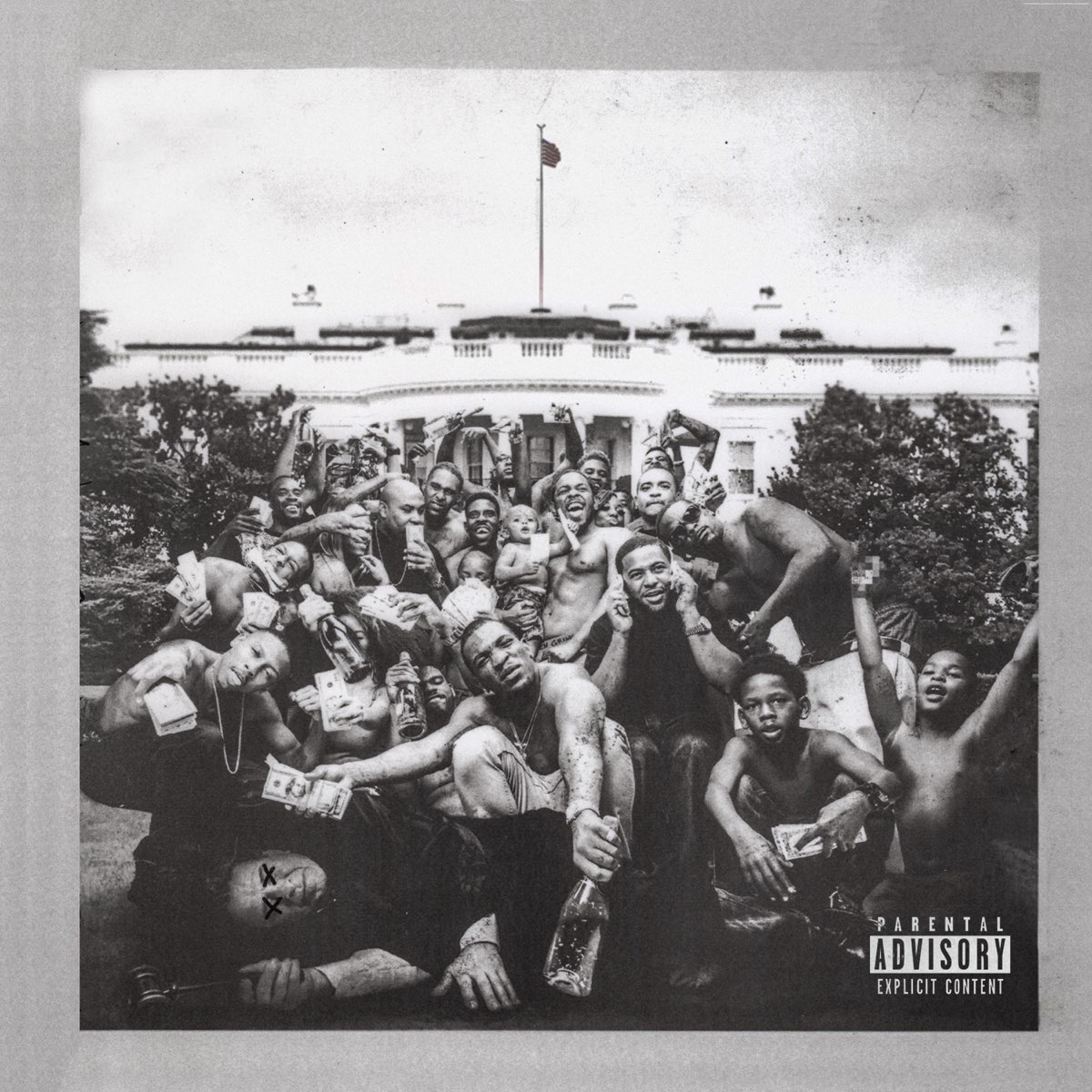
The To Pimp a Butterfly cover features a group of African American men and children gathered in front of the White House, symbolizing a powerful statement on Black empowerment and political activism. The photograph was the brainchild of photographer Denis Rouvre, capturing a spontaneous moment during a Lamar-organized trip to Washington, D.C. The money they’re holding represents wealth, power, and the racial tension in America, reflecting themes of economic disparity and cultural identity heard throughout the album. The image captures a poignant moment that ultimately challenges conventional symbols of success and highlights deeper societal issues.
Prince – Purple Rain (1984)
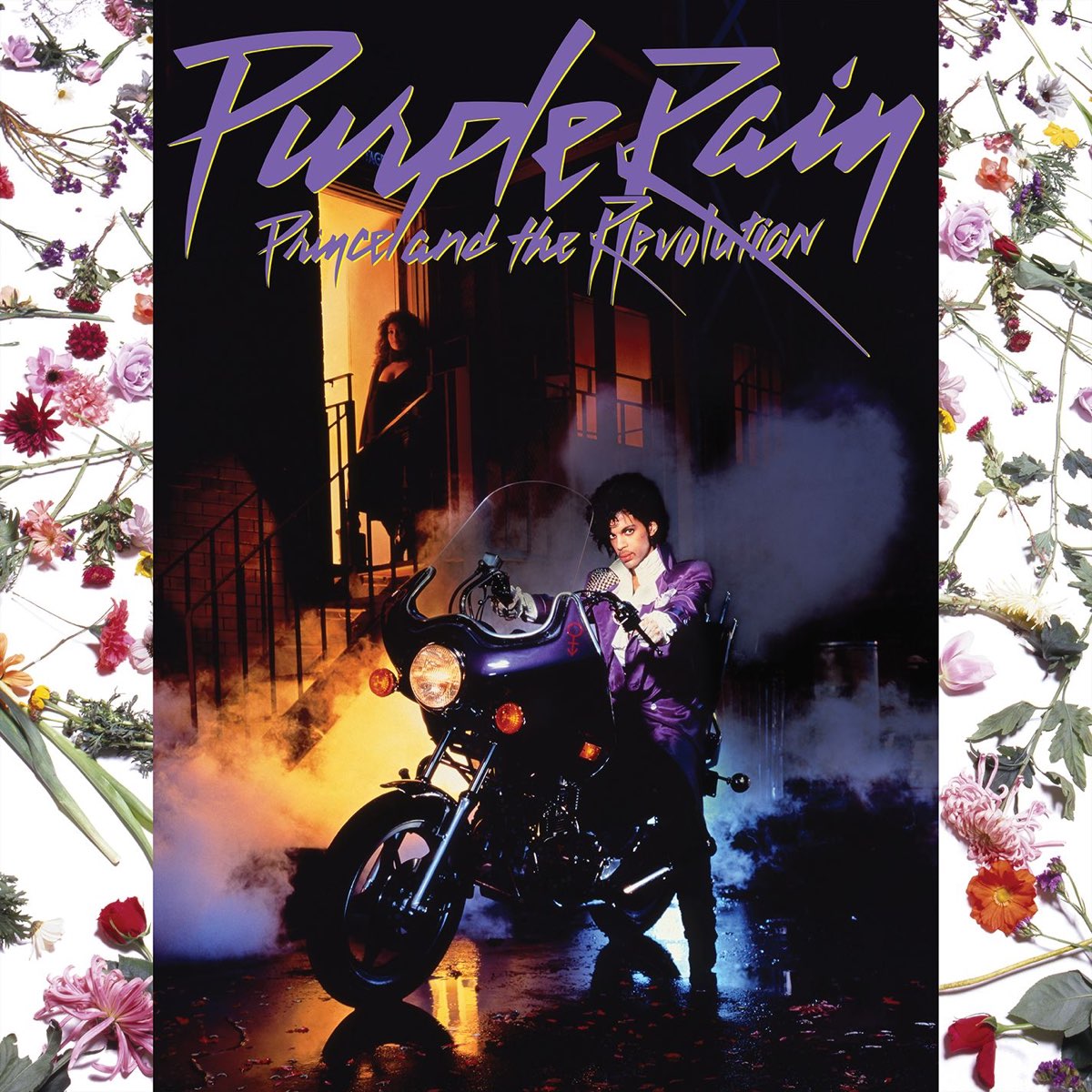
Prince never needed a crown, just a purple jacket, and a killer stare. Photographer Jeff Katz immortalized just that with one shot. The photo session aimed to grasp his confidence, charisma, and undeniability. The jacket itself became a symbol of his artistic identity, blending flamboyance with elegance. Katz’s photography for the Prince album masterfully creates a sensual scene featuring Prince and a woman, encapsulating the album’s themes of love, passion, and musical prowess. The imagery not only highlights Prince’s charismatic presence but also visually represents the album’s exploration of romantic and intimate themes, blending visual artistry with the album’s musical essence. This cover truly stands as a timeless tribute to Prince’s enduring influence and legendary status in popular music.
The Velvet Underground & Nico – The Velvet Underground & Nico (1967)
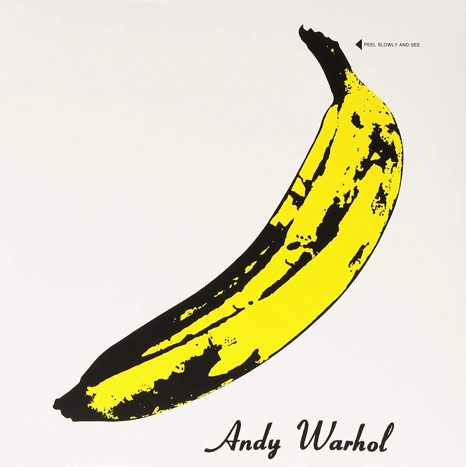
Andy Warhol’s design for the cover wasn’t just about aesthetics; it was interactive. The peelable banana sticker was a stroke of Warholian brilliance, transforming each LP into a one-of-a-kind piece of art. Contemplating whether to keep the sticker intact or unveil the banana initiated a playful frenzy among fans, embodying Warhol’s irreverent approach to art. Lou Reed would have likely found amusement in the chaos it caused.
Taylor Swift – 1989 (2014)

The polaroid-style photograph of Taylor Swift on her 1989 album cover marks her transformation from country roots to a full embrace of pop. The image is purposely cropped at her eyes as we focus on her sweatshirt adorned with seagulls, suggesting a sense of freedom and new beginnings. The design reflects the nostalgic yet modern vibe of the album, which is named after her birth year and inspired by the synth-pop sounds of the 1980s. The aesthetic was not only a nod to the ’80s but also tied into a deluxe edition of the album that included actual Polaroid photos taken by Swift. 1989 solidified Swift’s welcoming as a global pop icon as it became her best-selling album, and won the Grammy for Album of the Year.
Joy Division – Unknown Pleasures (1979)

When Joy Division was prepping the cover for Unknown Pleasures, they stumbled upon a stroke of cosmic inspiration. Drummer Stephen Morris discovered the complex yet simple image of pulsar waves in an astronomy textbook, blending science with punk rock aesthetics in a beautifully unexpected way. This cover art, as envisioned by singer Ian Curtis, transformed the abstract into the iconic, making the universe itself a canvas for their music. It remains a poignant symbol of the band’s artistic depth and the intersection of science and creativity in music.
Michael Jackson – Thriller (1982)
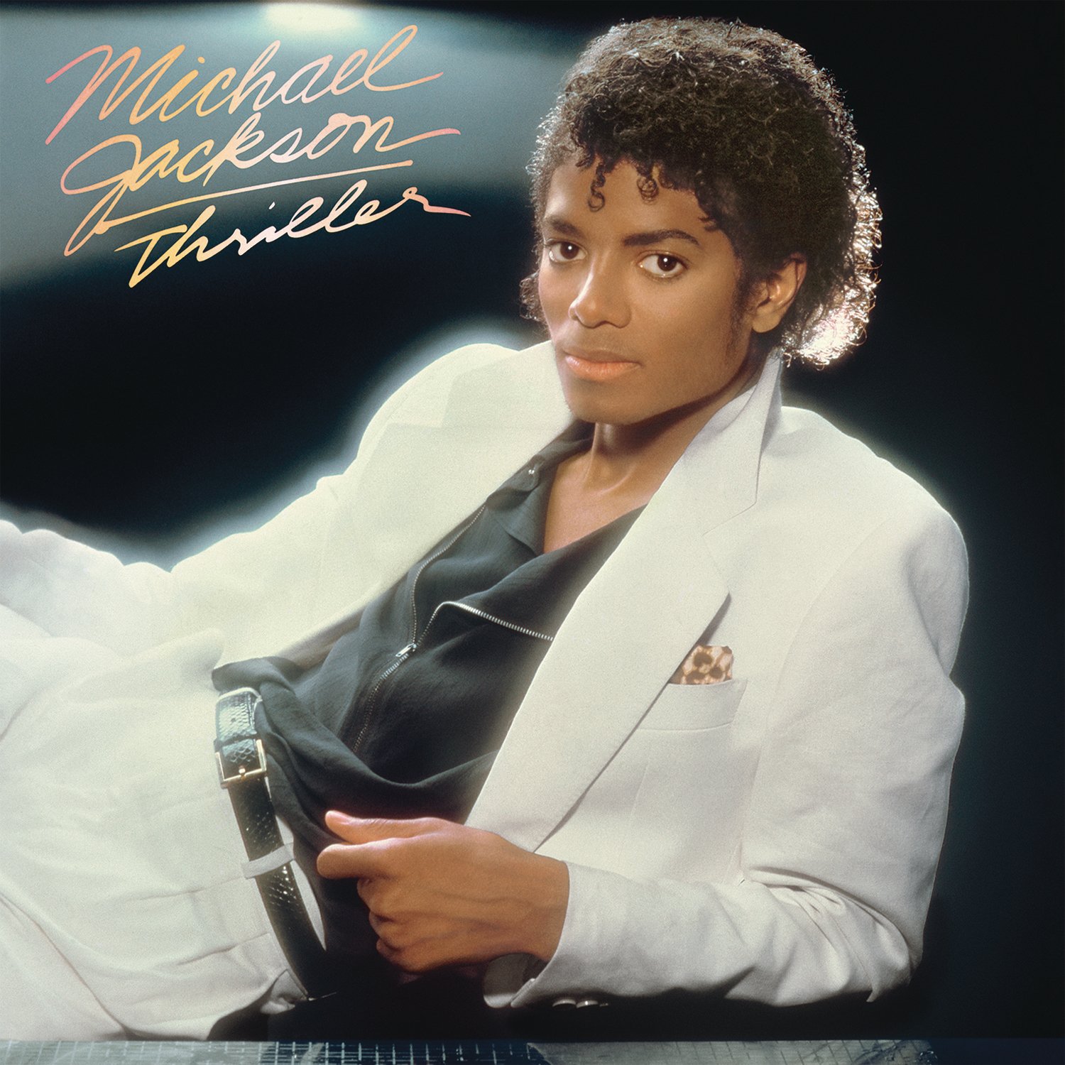
The initial Thriller album cover presents a prominent image of Michael Jackson posing with a tiger cub. However, this design was eventually replaced with the iconic image of Jackson in a white suit against a black background, flaunting a dramatic and mysterious expression. The decision to change the cover was influenced by artistic considerations and marketing strategies to enhance the album’s appeal and visual impact. The final version with Jackson in the white suit became widely recognized and synonymous with the album’s success, contributing to its iconic status in music history.
The Sex Pistols – Never Mind the Bollocks, Here’s the Sex Pistols (1977)

The Sex Pistols caused a frenzy with their 1977 album cover for Never Mind the Bollocks, Here’s the Sex Pistols. The brash yellow and pink artwork, conceived to provoke, was banned in several places, embodying punk rock’s anti-authoritarian spirit in vinyl form. The band aimed to shock and challenge conventions, reflected in the cover’s bold color scheme. The album’s initial title and artwork faced censorship, adding to its notoriety.
Bruce Springsteen – Born in the U.S.A. (1984)
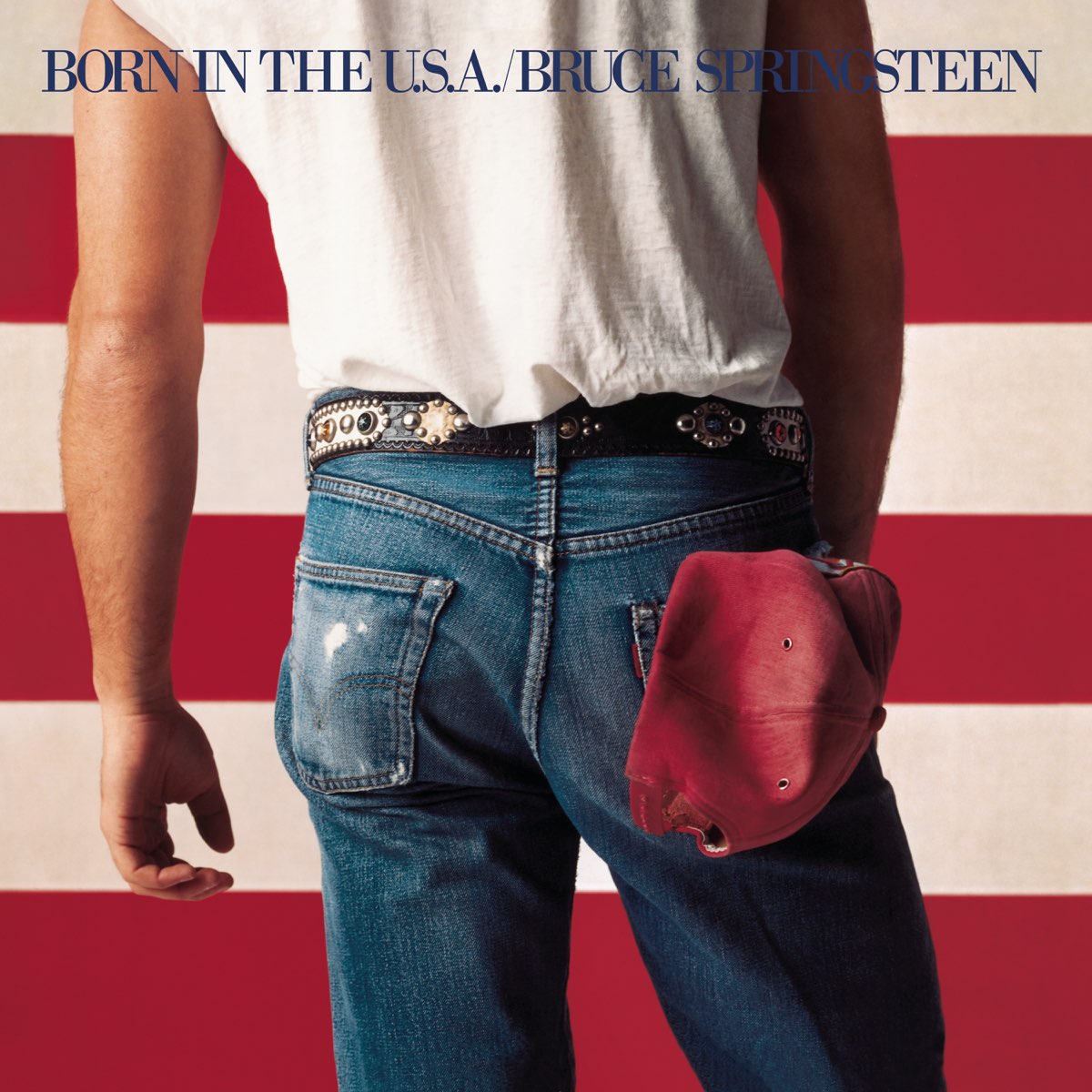
Considering the cover is predominantly Springsteen’s backside, it’s no wonder it caused a stir among fans. The image, shot by photographer Annie Leibovitz, was intended to evoke blue-collar pride and reflect the album’s themes of working-class struggles and patriotism. However, its interpretation as a patriotic statement, supported by a faded American flag, caused quite a debate among fans. Springsteen’s pose and the choice of denim were deliberate, aiming to display both the grit and glory of American life. Despite differing interpretations, the cover undoubtedly contributed to the album’s massive appeal, resonating with audiences worldwide.
Beastie Boys – Licensed to Ill (1986)
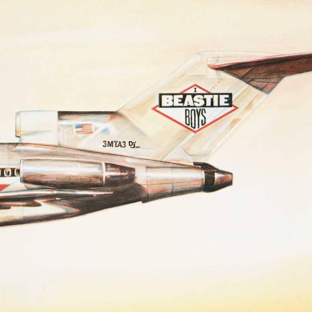
The Brooklyn trio didn’t just use a plane on their first album; they appropriately tagged it with graffiti bearing their name and title. This audacious move transformed an average Boeing 727 into a symbol of their party-starting reputation. The decision to use a plane as the cover art was inspired by their love for aviation and their desire to make a bold statement in the music industry. The plane’s tail number “3MTA3” cleverly spells “EATME” when viewed in a mirror, adding another layer of the Beastie Boys’ cheeky humor. Licensed to Ill or licensed to thrill?
Carole King – Tapestry (1971)

Carole King’s top-selling album, which has sold over 25 million copies worldwide, features a photo of her relaxing in her own living room. The picture, taken by rock photographer Jim McCrary, portrays King seated beside a window with her cat, Telemachus, nearby. This warm and personal image was inspired by King’s desire to convey a sense of home and domesticity, reflecting the themes of introspection and self-discovery found in her music. The cover’s simplicity and authenticity resonated deeply with fans, making it an iconic representation of King’s journey as a singer-songwriter.
Nas – Illmatic (1994)
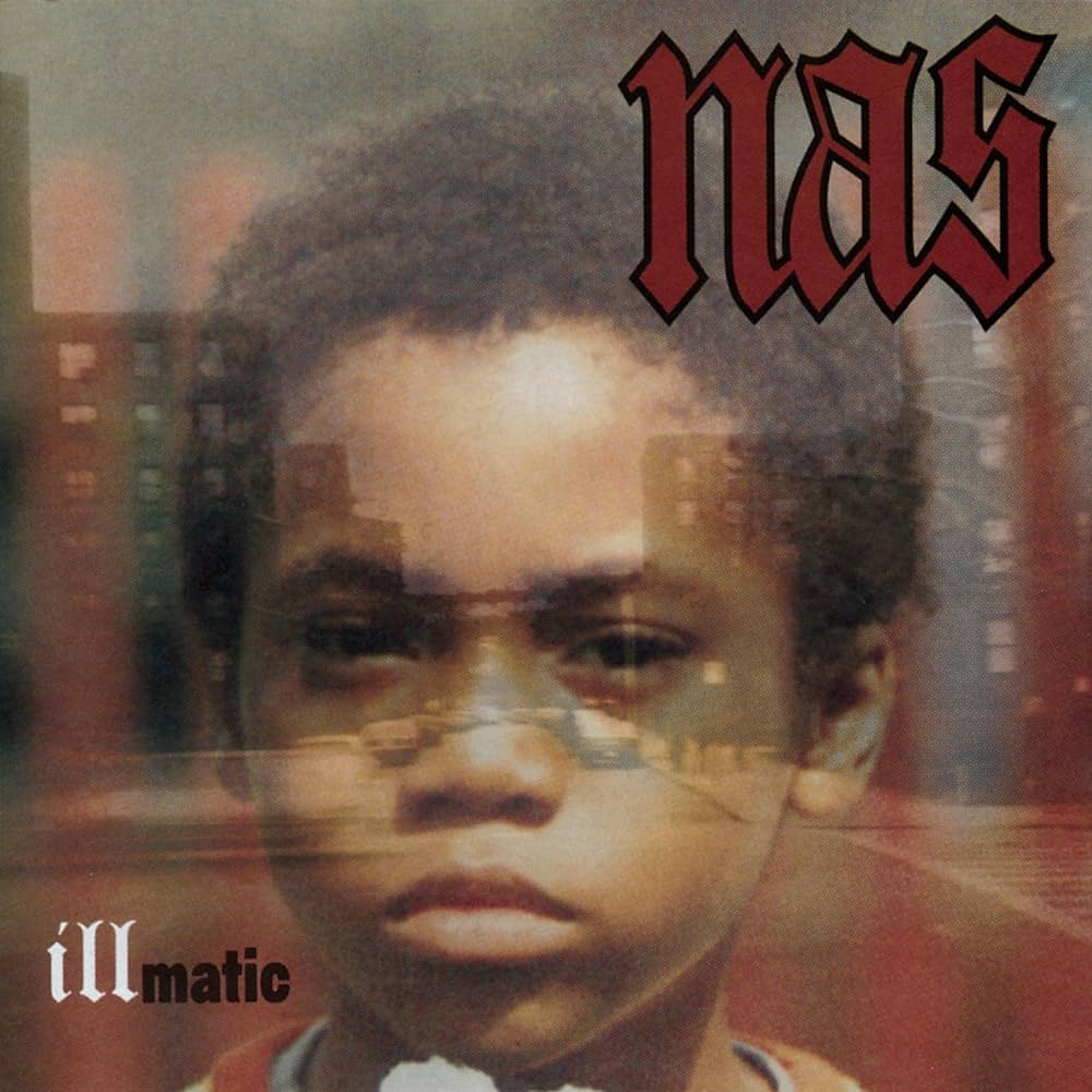
The cover for Illmatic showcases a photograph of a young Nasir Jones (Nas) as a child, superimposed over a gritty urban landscape of Queensbridge, New York City. The image, captured by photographer Danny Clinch, reflects the raw and autobiographical storytelling found throughout the album, which explores Nas’s upbringing and experiences in the inner city. “Illmatic” is celebrated not only for its lyrical prowess but also for its influential artwork, which encapsulates the essence of Nas’s debut masterpiece.
The Clash – London Calling (1979)
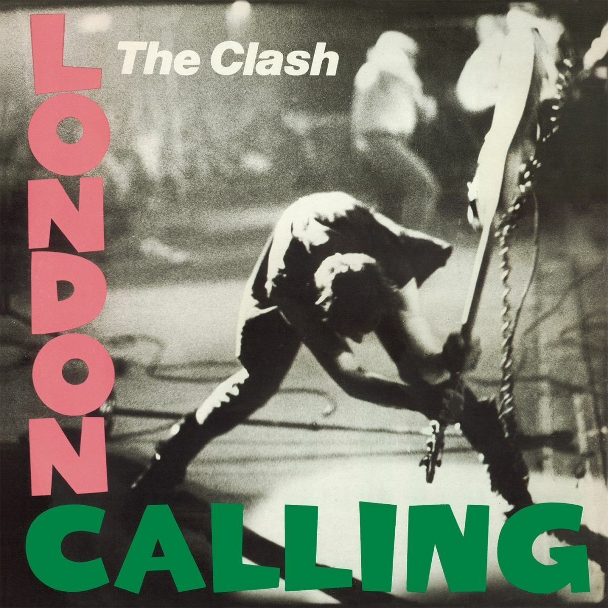
The Clash turned Paul Simonon’s legendary bass smash on stage into rock gold. The nonconformist act, caught on film by Pennie Smith, wasn’t just about breaking instruments - it was a statement of defiance. The photo nearly didn’t make the cut due to its slightly blurry quality, but its authentic portrayal of punk ethos won out. The cover’s design, with its homage to Elvis Presley’s debut album font and a distressed pink and green color scheme, further cemented its status as a cultural icon.
The Beach Boys – Pet Sounds (1966)
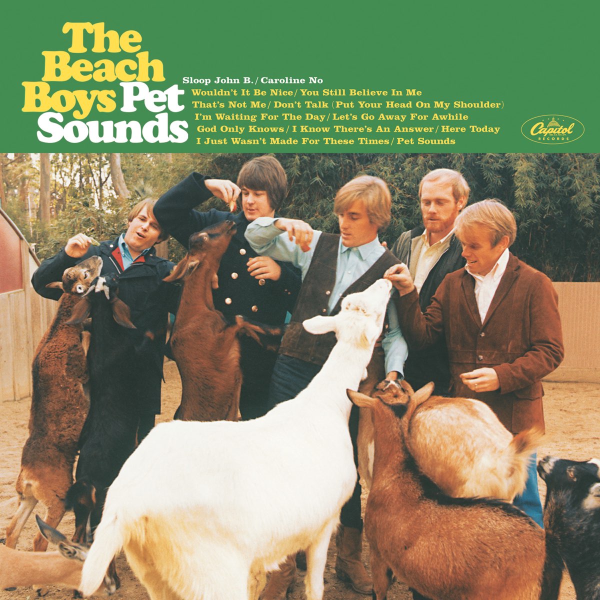
The cover of The Beach Boys’ Pet Sounds was the brainchild of Tom Wilkes, Capitol Records’ art director. It features a serene photograph of the band surrounded by a variety of animals at the San Diego Zoo, symbolizing the album’s title and themes of introspection and nature. The idea behind the cover was to mimic Brian Wilson’s vision of creating “a pocket symphony to God,” reflecting his deep artistic exploration and departure from surf rock into more experimental territory. The shoot itself was meticulously planned to convey a sense of harmony and innocence, aligning with Wilson’s meticulous approach to music production.
The Rolling Stones – Sticky Fingers (1971)
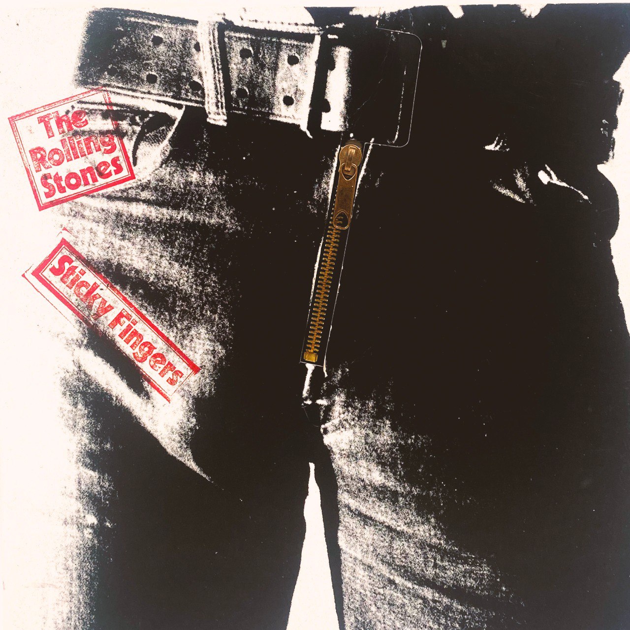
Andy Warhol was the creative mind behind this album’s provocative design. This rock ‘n’ roll masterpiece wasn’t just eye-catching; it was practical too - the zipper actually worked. It’s said that Warhol’s inspiration came from an image of a model in tight jeans. Thanks to Mick Jagger, who shamelessly showed off his denim, the cover became an instant classic, embodying the defiant spirit of the band and the era. The original concept included a photo of actor/model Joe Dallesandro’s crotch, a prominent figure in Andy Warhol’s art scene, adding to its edgy allure. The working zipper, however, caused production issues by damaging the vinyl records, leading to its repositioning during manufacturing.
Miles Davis – Bitches Brew (1970)
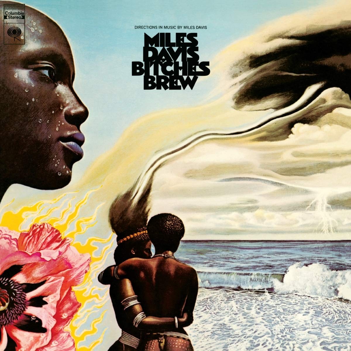
Miles Davis groundbreaking album Bitches Brew emerged with a symbolic cover designed by a German artist named Mati Klarwein. The surreal and vibrant color palette, rich with African-inspired imagery, beautifully conveys the album’s revolutionary fusion of jazz, rock, and funk. Using mixed media also helps layer the different textures, adding depth to the composition, much like Davis’s music. Klarwein also designed the famous cover for Santana’s Abraxas, showcasing his talent for creating visually stunning album covers that complement the music within.
U2 – The Joshua Tree (1987)
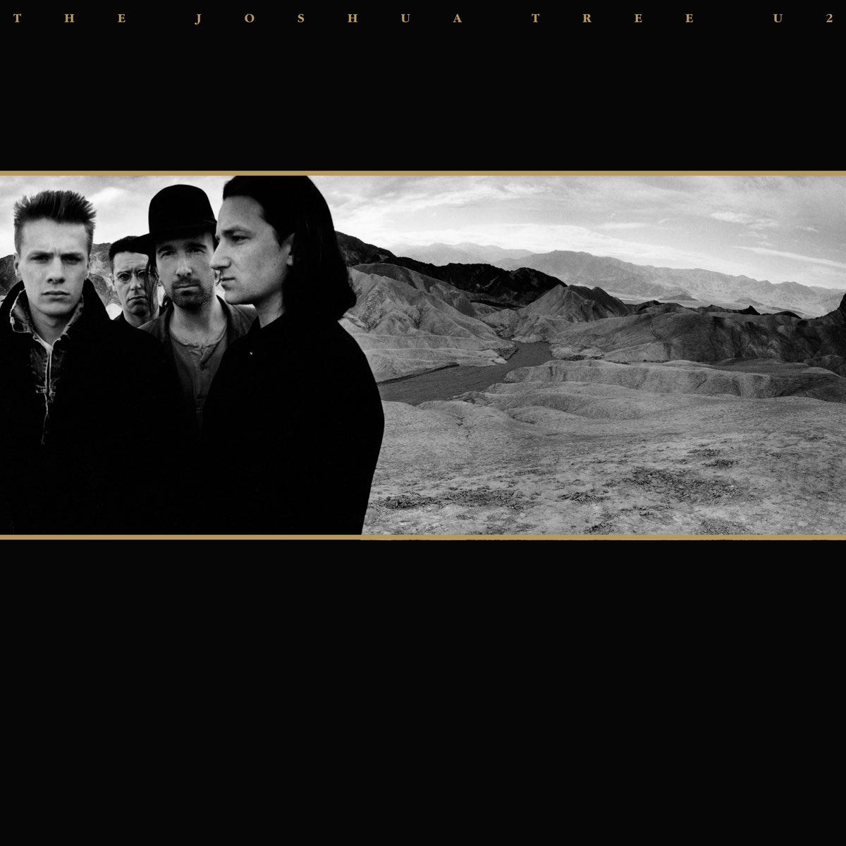
Taken by Anton Corbijn, The Joshua Tree cover focuses on U2 up against a stark desert backdrop with Joshua trees silhouetted against a clear sky. The cover’s expansive and atmospheric imagery reflects the album’s themes of American landscapes, spirituality, and political activism. U2’s decision to record the album in the Mojave Desert influenced the cover’s visual direction, capturing the band’s connection to the rugged beauty of the American Southwest. The cover’s stark imagery is synonymous with U2’s artistic evolution and global impact.
Radiohead – OK Computer (1997)

Radiohead presented a cryptic and dystopian landscape with digital distortions and abstract imagery for their OK Computer album, designed by Stanley Donwood and Thom Yorke. The cover’s bleak and futuristic aesthetic mirrors the album’s themes of technology, alienation, and societal decay as reflected in songs like “Paranoid Android” and “No Surprises.” The band’s collaboration with Donwood marked the beginning of a long-standing creative partnership, as he became an integral part of Radiohead’s narrative, creating captivating covers for Kid A and Amnesiac as well.
Ramones – Ramones (1976)
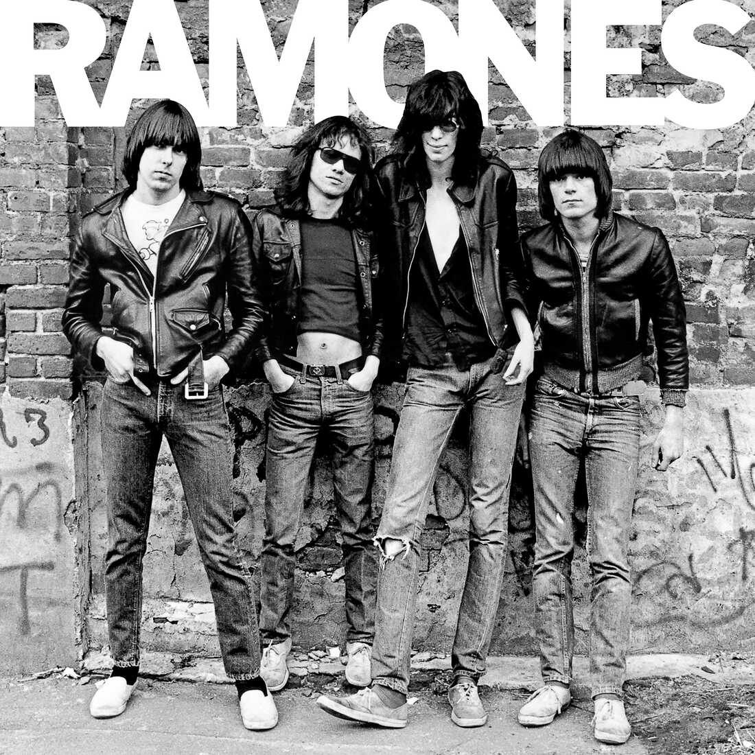
The Ramones’ self-titled debut album cover, photographed by Roberta Bayley, displays a minimalist black-and-white image of the band members standing against a brick wall in New York City. The cover’s straightforward design, chosen to reflect the band’s stripped-down punk rock sound and DIY standards, became an iconic symbol of the punk movement. Behind the scenes, the photo shoot was spontaneous, capturing the Ramones’ rebellious spirit and streetwise attitude. Hits like “Blitzkrieg Bop” and “I Wanna Be Your Boyfriend” showcased the album’s fast-paced, high-energy style, influencing generations of punk and rock musicians.
Johnny Cash – At Folsom Prison (1968)
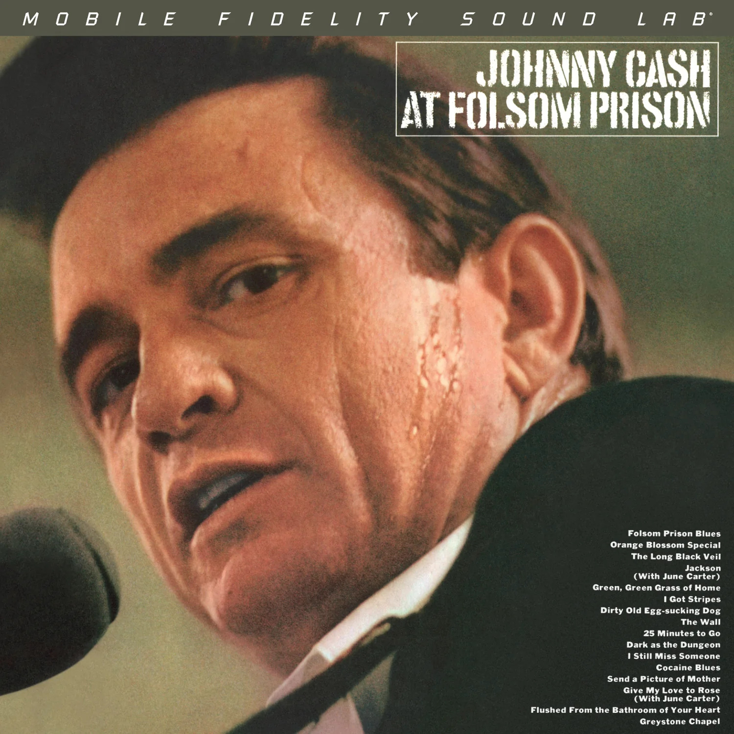
At Folsom Prison captures Johnny Cash performing live at California’s Folsom State Prison, with the cover photograph showing a sweaty Cash staring into the audience. The album’s cover, designed to reflect Cash’s connection with the incarcerated and his outlaw reputation, was groundbreaking in its authenticity and realness. Cash’s decision to record a live album at Folsom Prison was initially met with skepticism but ultimately became a career-defining moment. Songs such as “Folsom Prison Blues” and “Jackson” encapsulated the album’s profound emotional resonance, striking a chord with both listeners and critics alike.
Elton John – Goodbye Yellow Brick Road (1973)
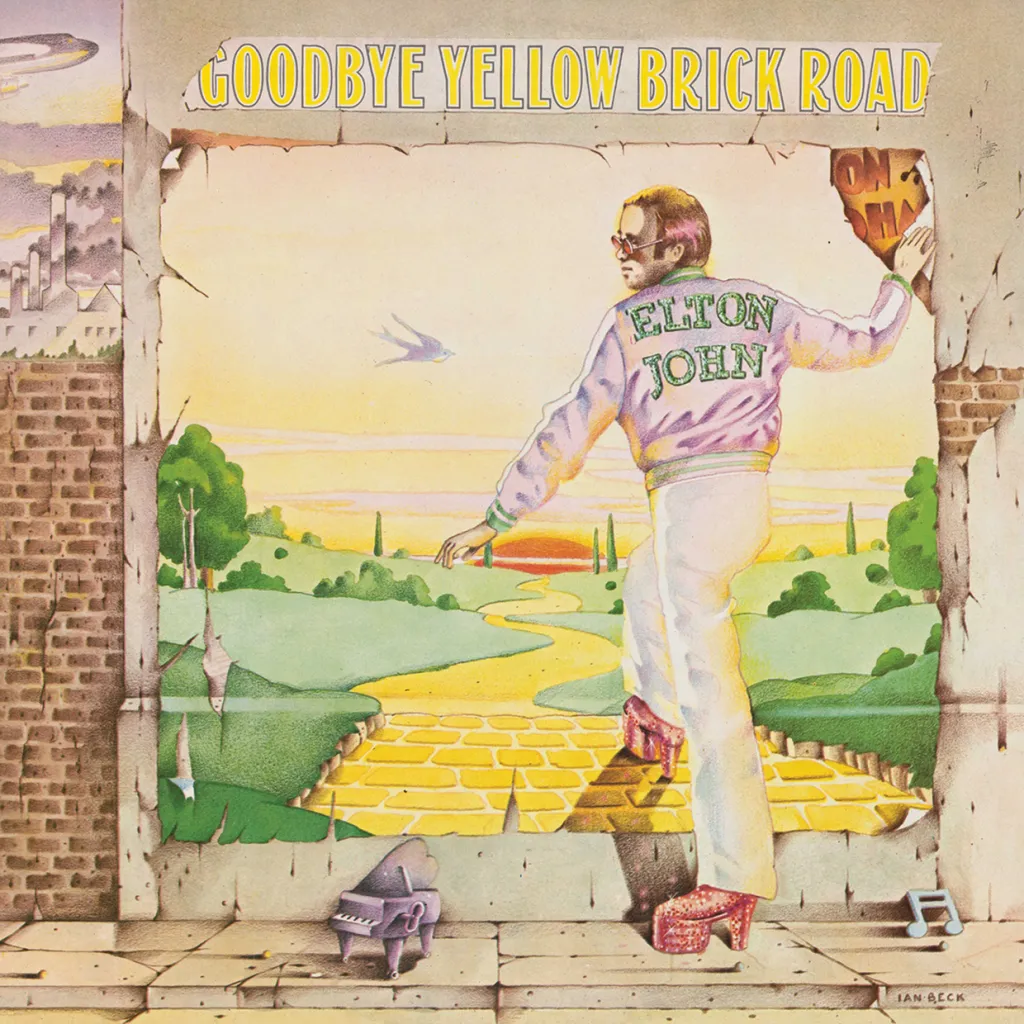
The cover of Elton John’s seventh studio album is as vibrant and fantastical as the music within. Designed by David Larkham and Michael Ross, the artwork features Elton stepping off a yellow brick road, with whimsical elements inspired by the film The Wizard of Oz. It’s as if he’s leaving behind the glamorous life, possibly alluding to themes of disillusionment with fame and a return to reality. The original painting used for the cover was created by artist Ian Beck, who infused it with a sense of theatricality and magic that mirrored Elton’s flamboyant persona. With hits like “Bennie and the Jets” and “Candle in the Wind,” the album became a defining moment in Elton John’s career, showcasing his musical versatility and storytelling ability.
Marvin Gaye – What’s Going On (1971)
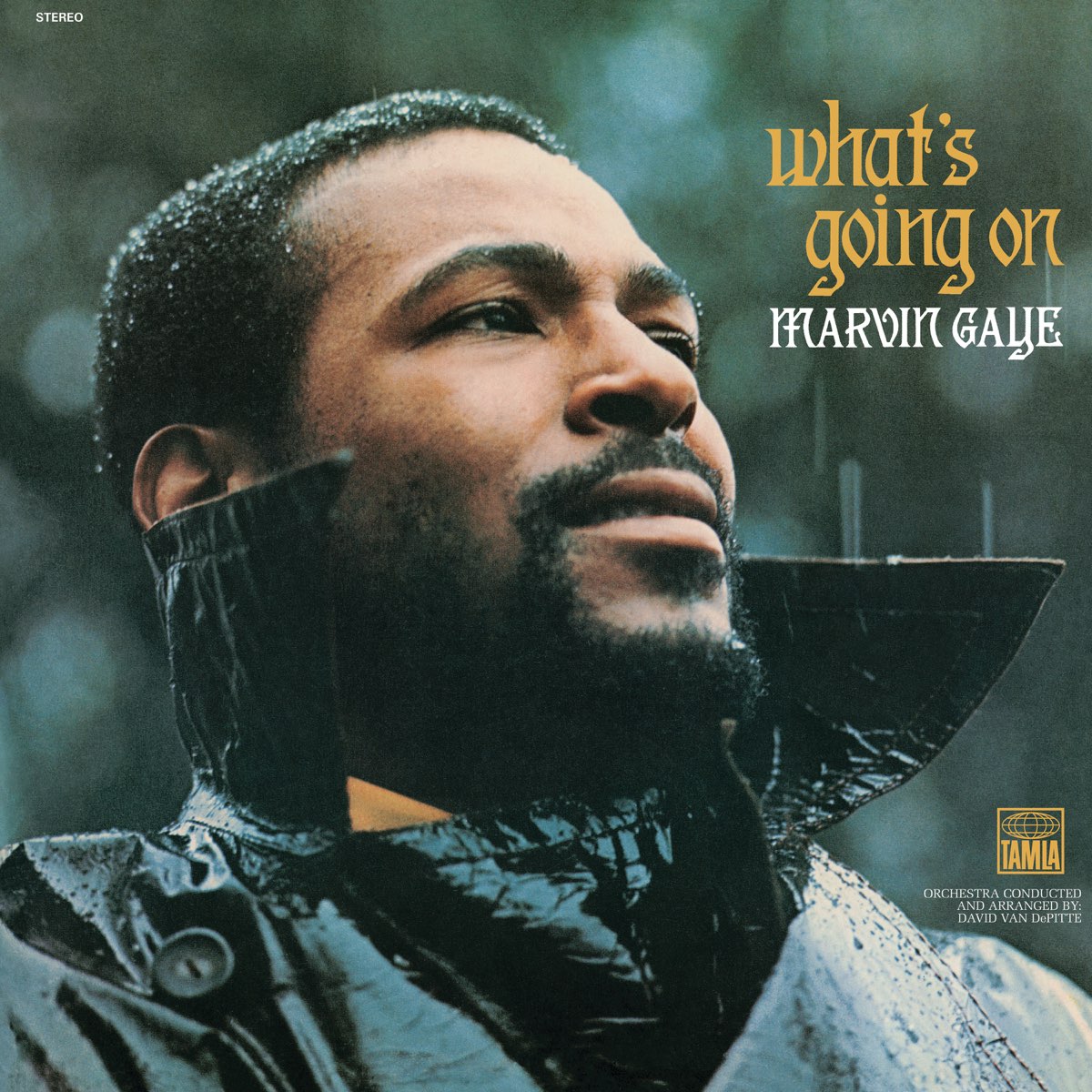
Marvin Gaye’s What’s Going On album cover was shot by Jim Hendin, a photographer known for capturing candid moments. The cover’s concept evolved from a spontaneous photo taken during a casual visit with Gaye. He sought to portray Gaye authentically, catching him in a moment of reflection amid urban surroundings. Gaye’s expression reflects the album’s themes of social consciousness and personal introspection, resonating with the turbulent times of the early 1970s. This iconic image not only encapsulates Gaye’s soulful presence but also serves as a powerful visual representation of his musical and cultural impact.
Patti Smith – Horses (1975)
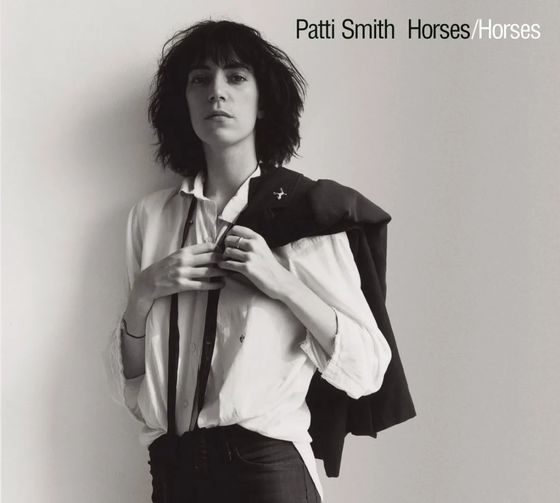
Few album covers are as evocative as Patti Smith’s Horses. Photographed by Robert Mapplethorpe, the cover features a striking black-and-white image of Smith in a white shirt with a black jacket slung over her shoulder, exuding an androgynous elegance that challenged traditional gender norms. The shirt she wore belonged to Mapplethorpe, underscoring the intimate and collaborative nature of their friendship and artistic partnership. The minimalist backdrop directs all attention to Smith’s strong gaze and unapologetic stance, ultimately evoking the power of the poetic punk songs within, like “Gloria” and “Free Money.”
The Beatles – Abbey Road (1969)
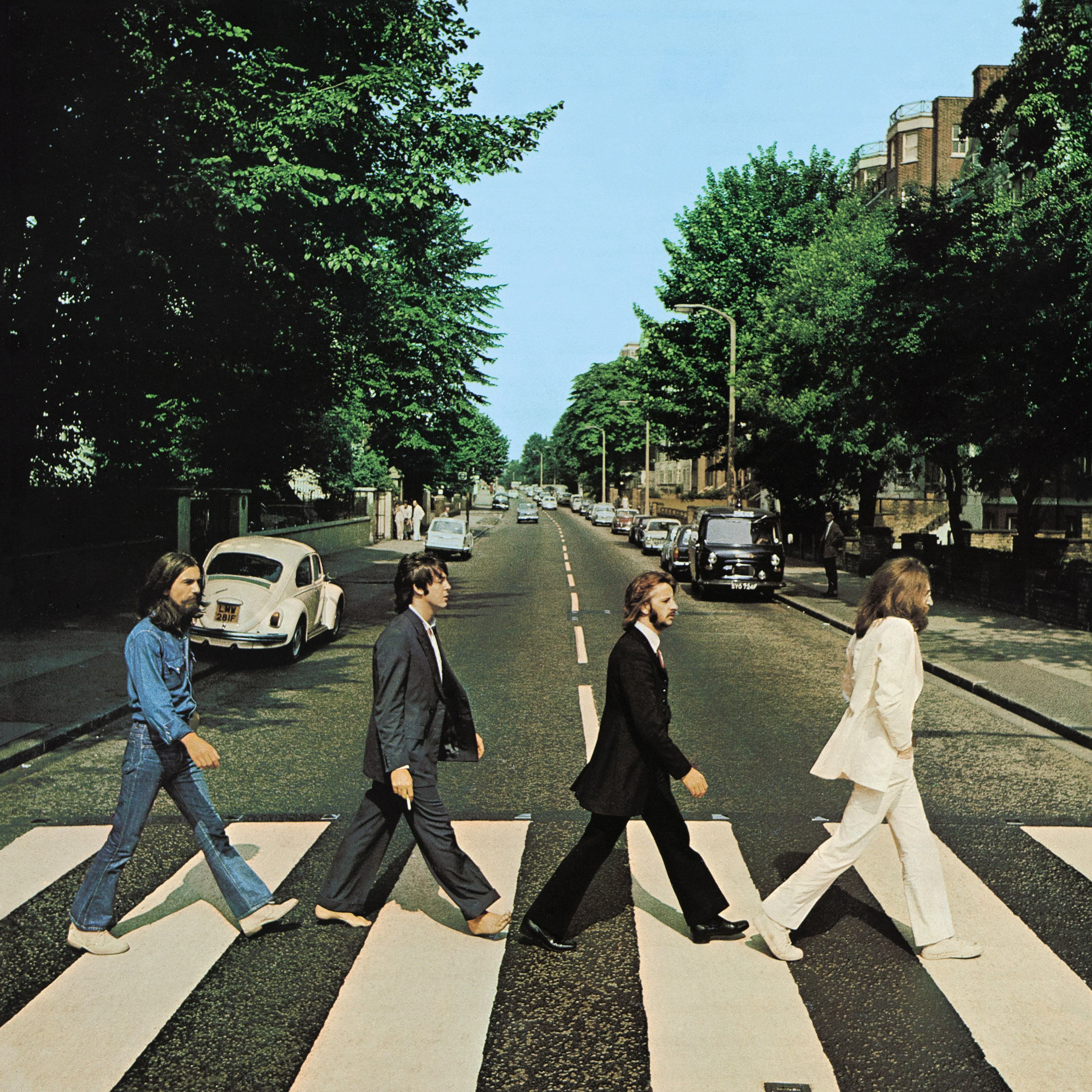
The band’s
leisurely stroll across the zebra crossing not only halted traffic but also
sparked controversy. Paul McCartney’s decision to go barefoot ignited numerous
theories and myths over the years, most famously the “Paul is dead” conspiracy.
However, the real reason behind his lack of footwear is much more mundane. According
to McCartney himself, he simply found the shoes uncomfortable on the hot August
day when the photo was taken. While he portrays a more casual look in a blue
suit holding a cigarette, Lennon wears an all-white one, giving a sense of
purity and peace. Ringo went with a black suit as George Harrison sported an
all-denim fit, providing a more laid-back look. Photographer Iain Macmillan was
able to solidify the shot in just ten minutes, seizing a moment of calm amidst
the bustling London street. The image’s enduring popularity has made Abbey Road
one of the most recognizable and imitated album covers in music history.
- Lindsey
Harrison - spin.com